


Falling somewhere between ambigrams, autological words, concrete poetry and graphic design, but with a definite mathematical slant, these seem to be a new artform, albeit (at least the ones I do) requiring varying amounts of math background to really appreciate. Some of these, particularly the earliest batch, are more like puzzles - to work out what the words say, and are probably impossible to 'get' without knowing about the concepts described. The name, 'autologlyph' is with reference to autological words, and they could equally be called 'autological images'. I gave a talk at Gathering 4 Gardner 9 on autologlyphs, a pdf of the talk is available here. A pdf of my exchange gift for the gathering is also available here.
On many of these, features at the level of individual pixels are important, so the scaled down thumbnails don't really do all of them justice.
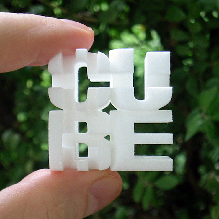
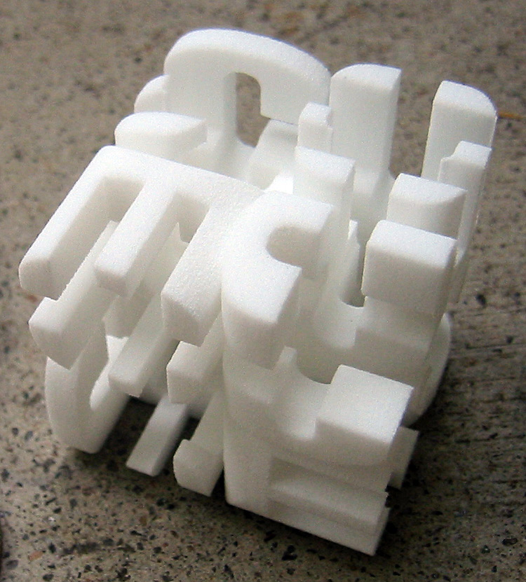
(September 2009) 3D printed cube, with the word viewable along each of the 3 axes. I made this by taking the intersection of the extruded word in the three dimensions. There is a similar object on the cover of Gödel, Escher, Bach. It seems to be a difficult problem in general to make sure that the result of this kind of process is a connected object that looks as intended from the different directions.
All of the 3D printed objects on this page are available from my page on Shapeways.
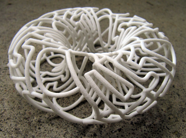
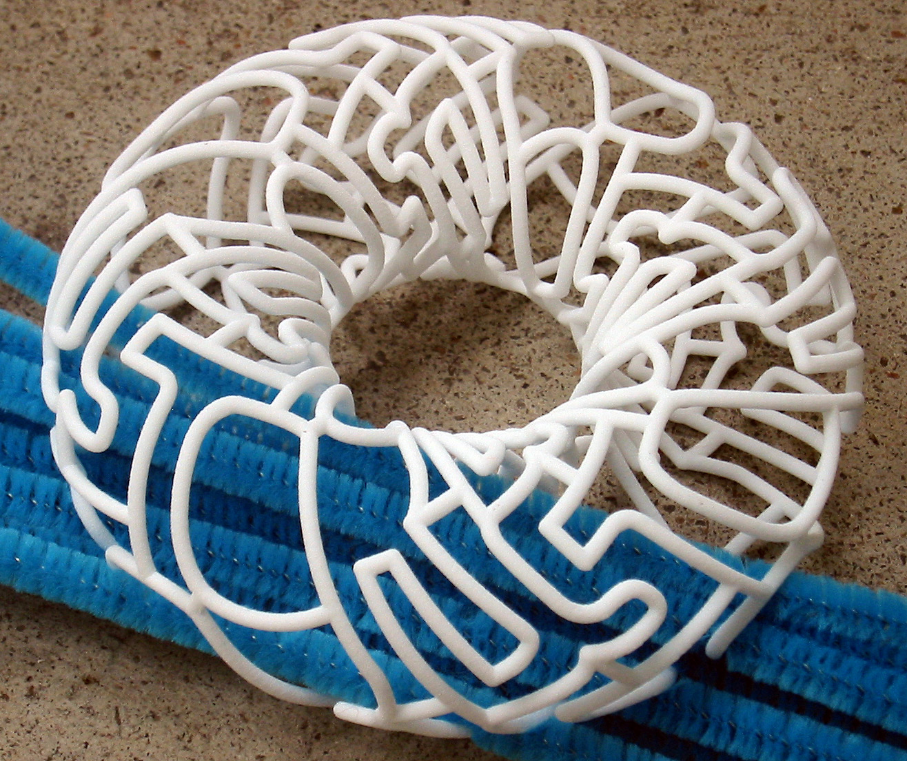
(September 2009) The torus autologlyph updated to a 3D torus. Since printing on a non-flat surface doesn't work well, the only sensible way to do it and have it mathematically precise was using 3d printing. The network of edges looks cool, but makes it difficult to read, particularly from a photograph only. In the second photograph there are some pipe cleaners inside the torus to make the front side more readable.
YouTube video of this sculpture.
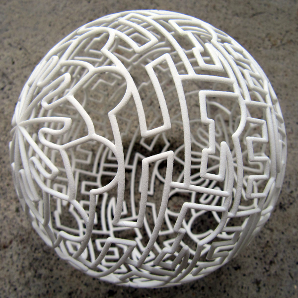
(September 2009) Another 3D printed word tessellation, this time on the surface of a sphere. The word "sphere" appears 20 times, and so the symmetry of the object is D10.
YouTube video of this sculpture.
(August 2004) Another reasonably large project, I first had the idea about a year ago. Paul-Olivier adapted Duane A. Bailey's Penrose tiling program, and used data from paths drawn in Photoshop, to make a postscript file to draw it. Then back into Photoshop for colouring and effects.
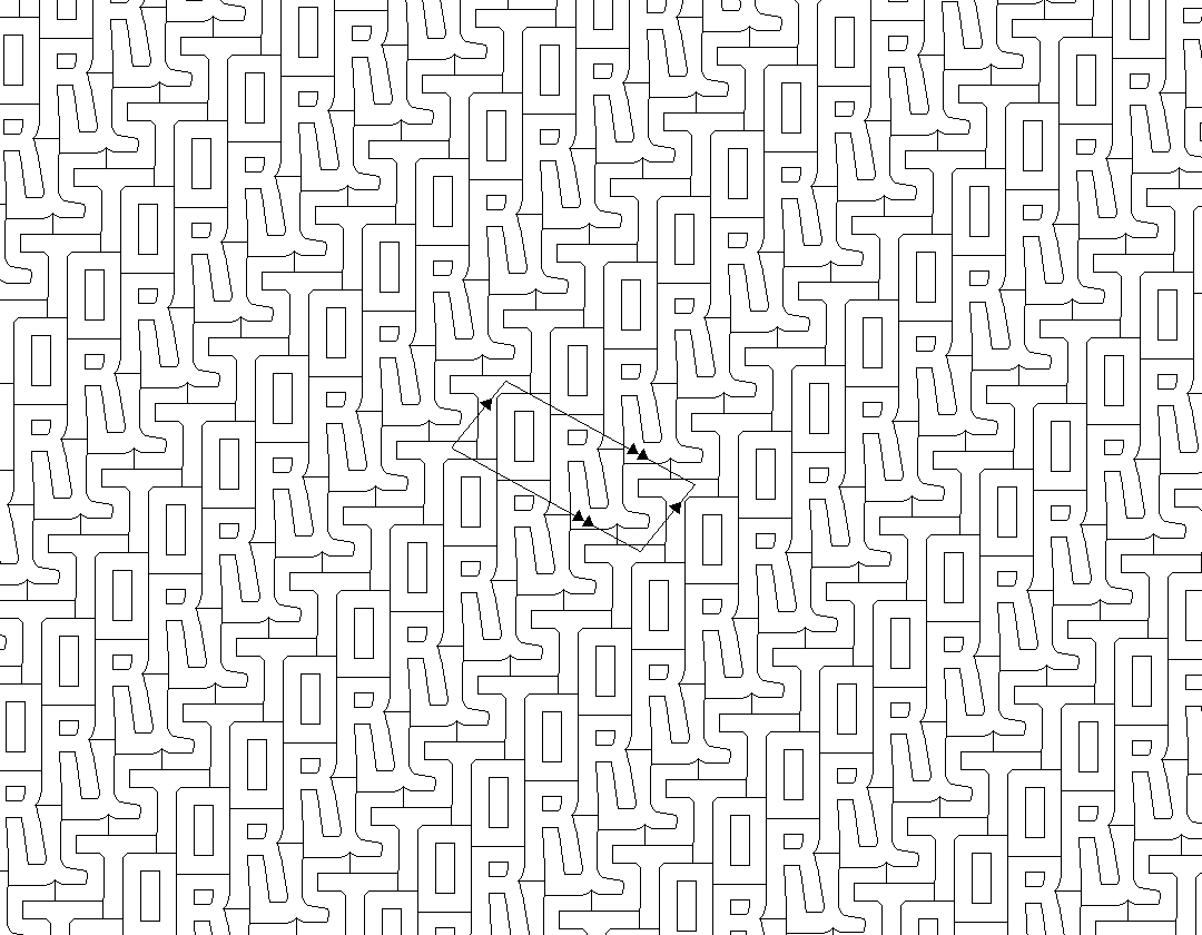
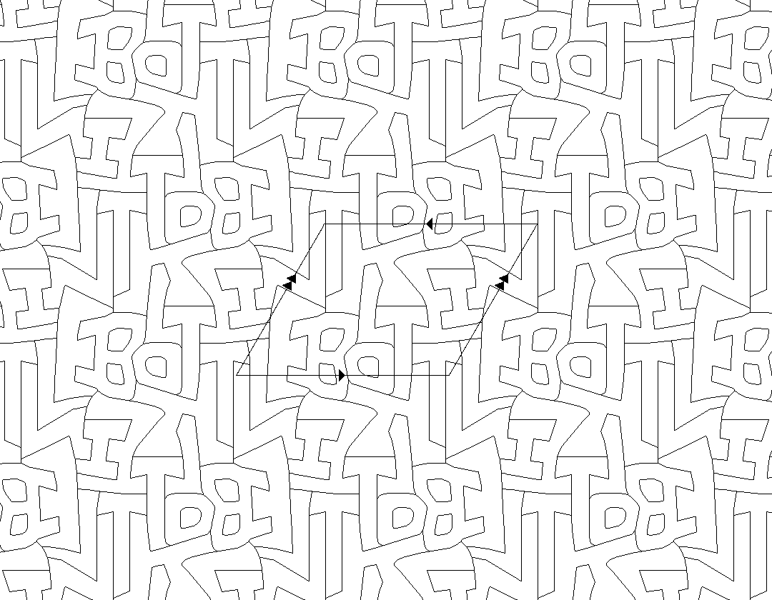
In the other tesselation autologlyphs each edges matches to only one other edge, so the line between them has to serve two purposes. Here, because of the choices in how the two tiles can fit together, the two kinds of edge of the tiles have to serve four purposes.
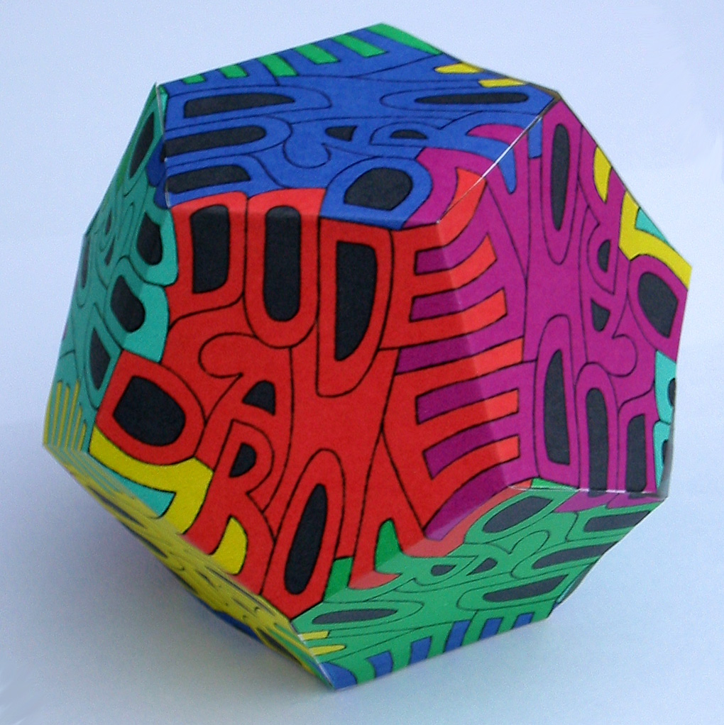
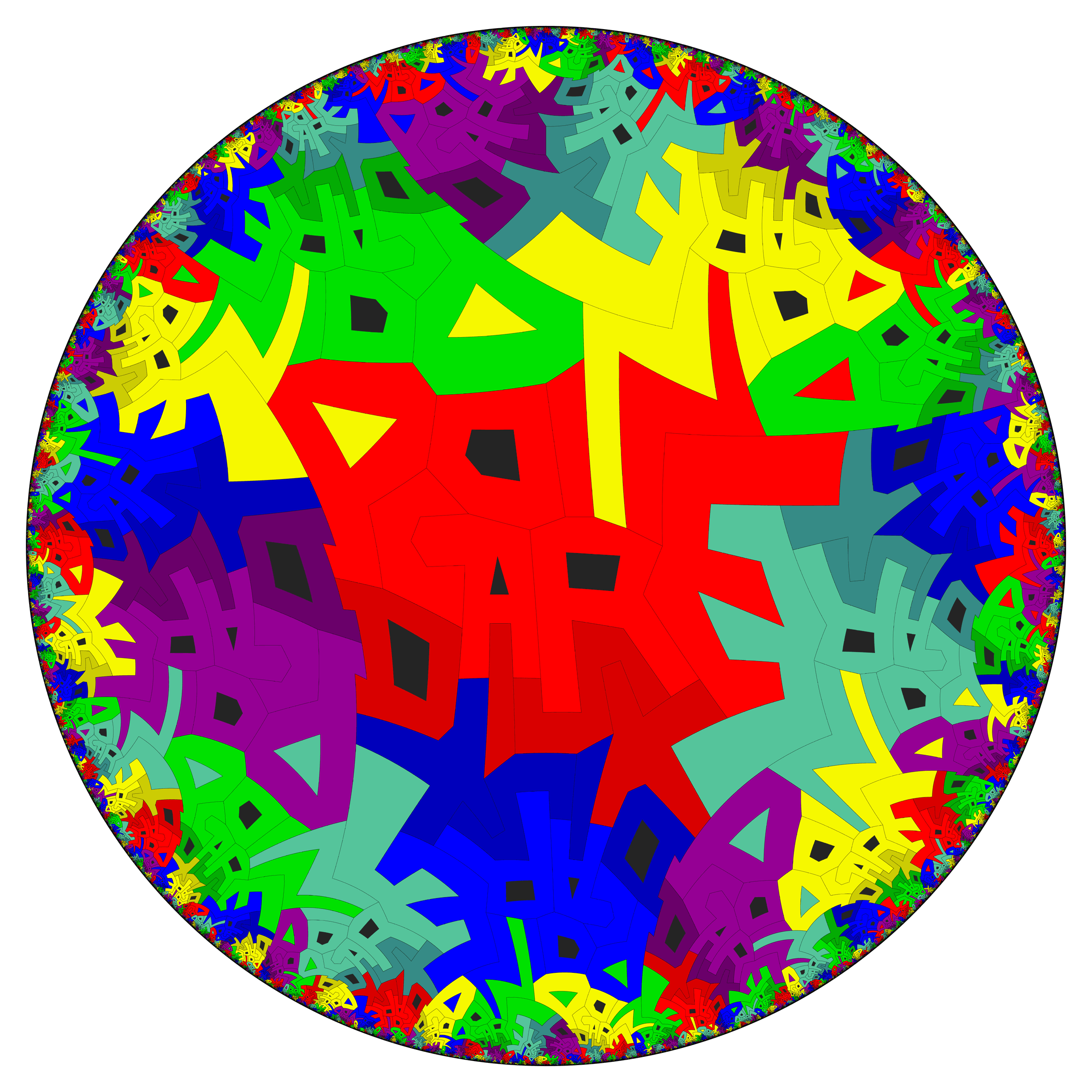
(January 2004) A similar idea to the Poincare disk, but was much less work, only needing a pentagon, printer, pencil, scanner and Photoshop. In the Poincare disk as in this the word(s) fit inside a pentagon, and in PD the neighbouring pentagons are related by a 180 degree rotation. Here only one of the 5 edges is like this, and the others pair up differently, which leads to some interesting symmetries over the whole dodecahedron.
A high resolution version good for printing on letter size paper at 300dpi is here. Update: better, pdf version.
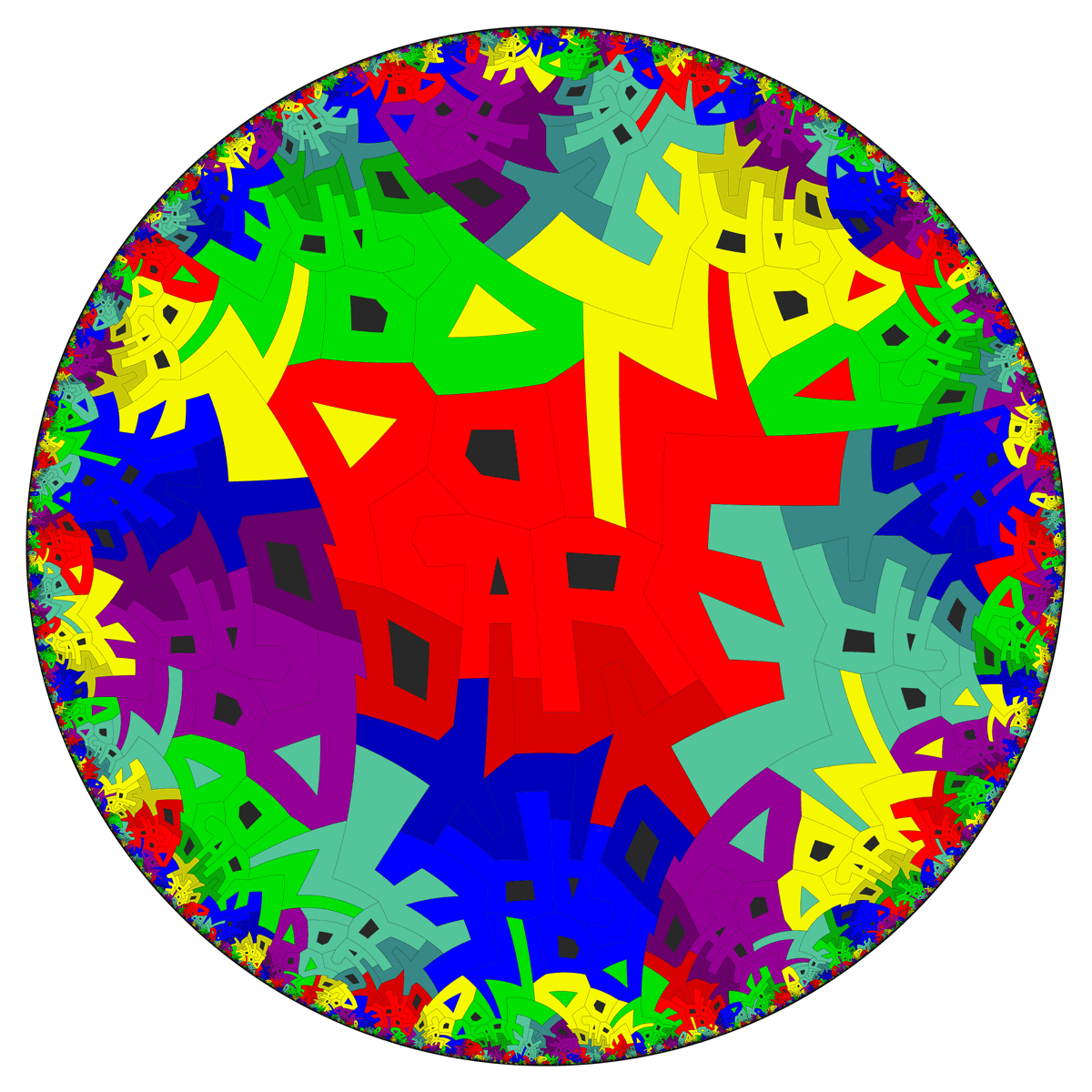
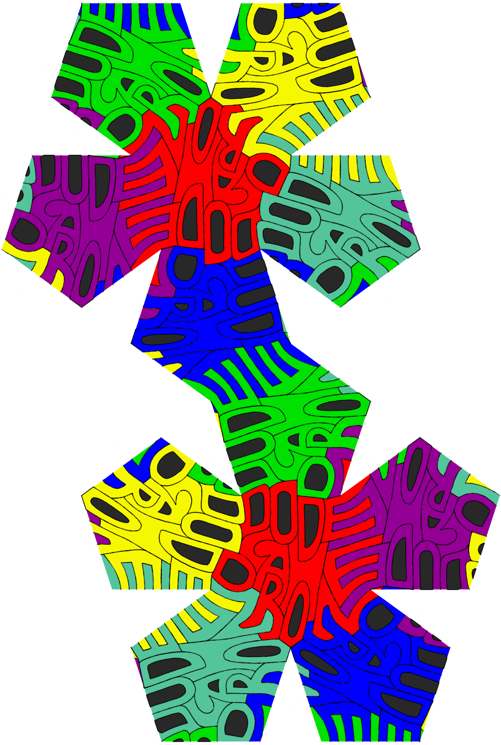
(February 2003) This was by far the most complex and ambitious project yet. The basic idea is the same as two of the autologlyphs in 'autologlyphs4.jpg', but we went much further with this one. The basic pattern is a tiling of the Poincare disk with five pentagons around each vertex. The vertex is now inside the tip of the 'E'.
Paul-Olivier worked out how to use this Mathematica notebook by Matthias Weber, which deals with the calculations needed to do rotations in the Poincare disk and create the images. We put in many of the points of the central copy 'by hand', typing in coordinates. Many of the others needed to be on geodesics defined by other points, and the notebook has tools to do that sort of thing. Having worked out how to get it to rotate words of a colour to other words of that colour, we had Mathematica output as pdf files the outlines of those words in each colour (so for example one file for red 'disk's). This makes colouring them correctly in in Photoshop possible. From start to finish it took between 50 and 100 hours of work over a period of a month, with maybe 15 hours of computer calculation. The final output is a huge gif file, 9600x9600 pixels and just over 4MB, so looks good printed at poster size 32"x32" at 300dpi. Available on request. For a slightly less ludicrously large image, look at this.
(January 2003) Based on a design by Will Segerman. It's remarkably difficult to read letters arranged this way.
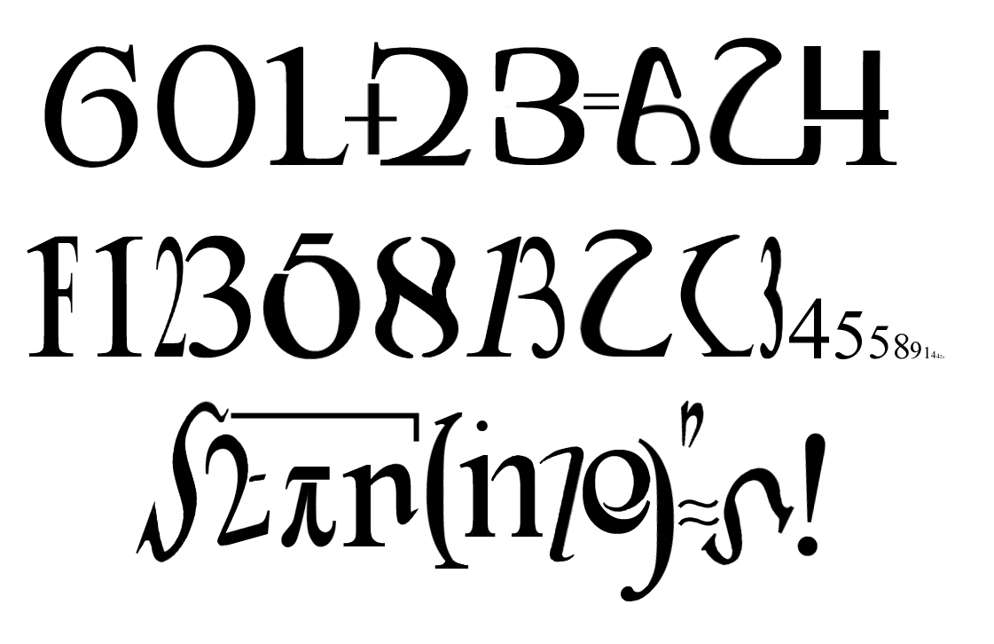
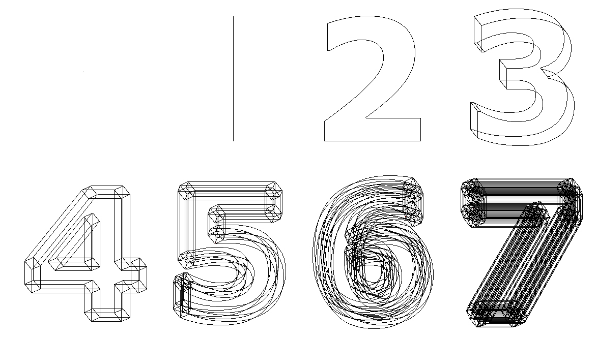
(January 2003) An ambigram-like idea. Ambigrams of two different words but without a rotation or other transformation are very hard to do well - having a rotation makes it easier for the brain to ignore elements of the image designed for one word when seeing the other. Here the 'transformation' is from words in English to numbers and equations.
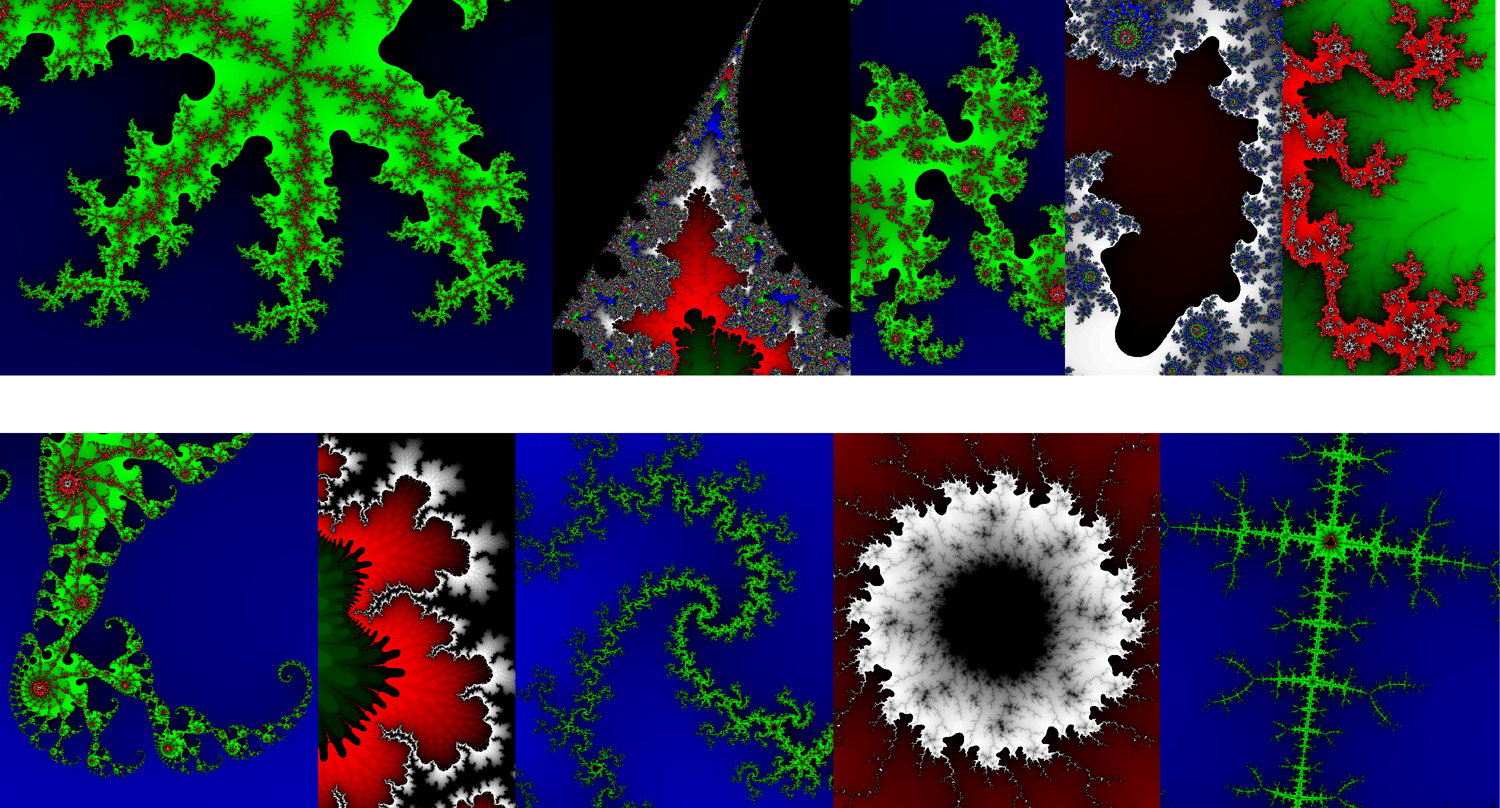
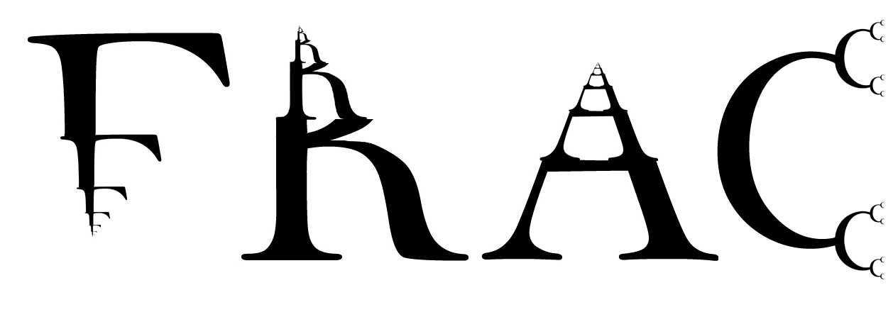
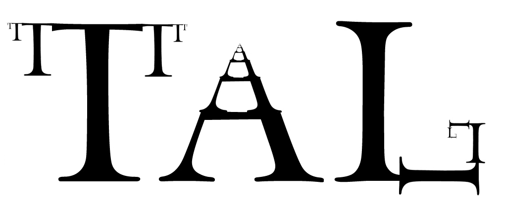
(January 2003) The images were generated by this freeware fractal generator. None of them are rotated at all, they're just copy and paste from the set. The process of searching for letters is interesting: presumably because its a fractal, a good technique seems to be to find something that looks near right, then zoom in around it. Chances are something nearer to what you want is in there when you zoom in, better orientation or shape, so I 'evolved' towards good letters. Here is a bigger version on two lines for printing.
(December 2002) Fifth line down is a registered trademark, owned by Solomon Golomb. Based on an idea by Rick Rubenstein.
See T-shirts for an updated version.
(December 2002) A few new ideas here and the first ones from algebra. Representing a function as two parts, the domain and range, seems to be an idea worth exploring. The third function down seems far too good to be true, but somehow it works. The lower left autologlyph needs to be printed out and a hole punched in the marked spot to work properly. Here and here are 'answers' to two of them.
(December 2002) A bit of a departure here - I guess I could have done this as a word, the same way the other autologlyphs are, though that's not how the idea came up.
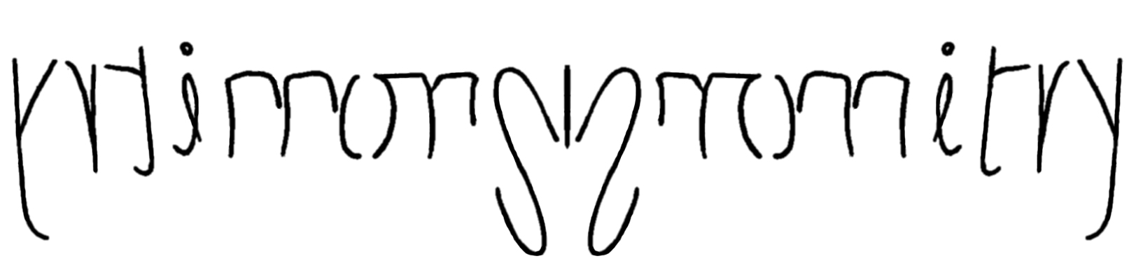
(November 2002) Another ambigram/autologlyph crossover. The multiple "m"s look roughly the same, which is good. The "y"s are less similar but they are further apart from each other, which helps.
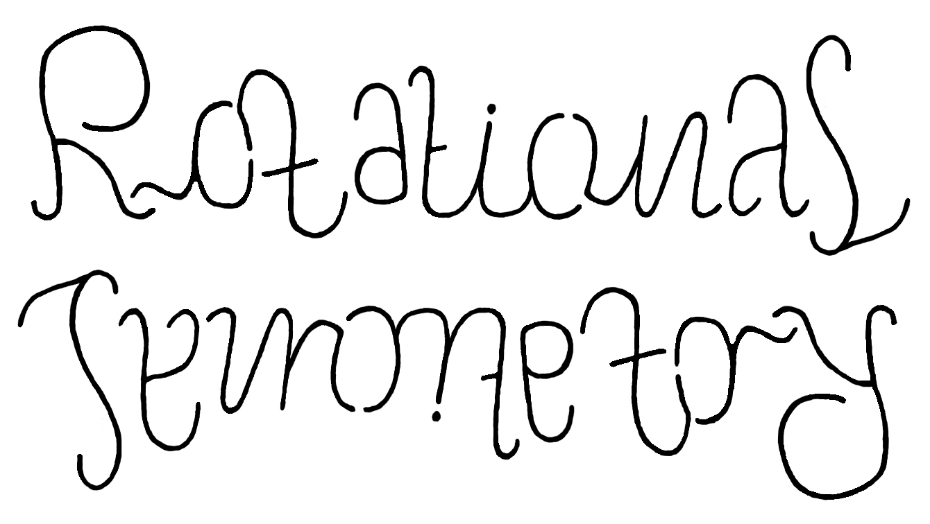
(October 2002) This one is both an ambigram and a autologlyph. It's unfortunate that I had to cheat with the first 'y', although at least it is recognisable as a reflected 'y' as opposed to some other letter. Maybe given the context I get a bit more leeway?
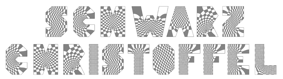
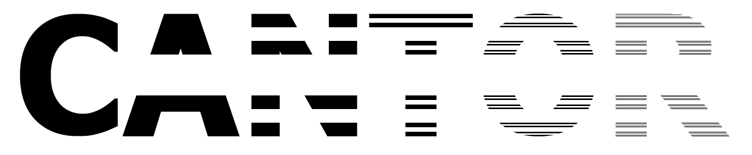
(May 2002) Paul-Olivier tracked down a program (thanks to the author, Toby Driscoll) which calculates the appropriate conformal maps (somewhat temperamentally!) and draws the lines in, then we just had to colour in the squares. Even larger version.
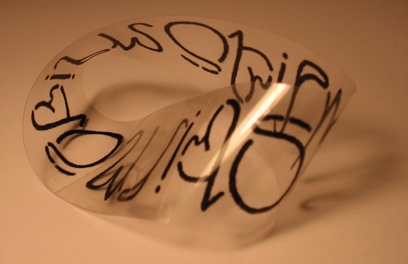
(February 2002) A crossover from ambigrams, this one is best viewed when printed out on an overhead projector transparency, cut into strips, then made into actual Mobius strips, as in the second picture.
There are 3 copies of the phrase 'Mobius Strip', but it is only printed 1.5 times.
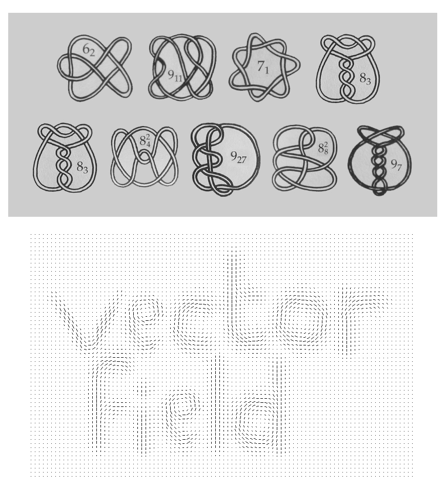
(January 2002) Top is another puzzle, illustrations originally in "..... and Links" by Dale Rolfsen (Publish or Perish Press, 1976) (blanked out word will be obvious on solving the puzzle...). Bottom was done 'by hand', although there was scope for some copy and paste, with reflections.
(January 2002) The 'C' used to be two self-similar spirals, and although that worked with the mathematical theme, it turned out too smooth-looking in relation to the other letters. The 'R' was also difficult. The full size picture is too large to print out on one sheet, so here are the left half, and the right half.
(January 2002) Another process, this time with a space-filling curve. Yes, it did take forever to do...
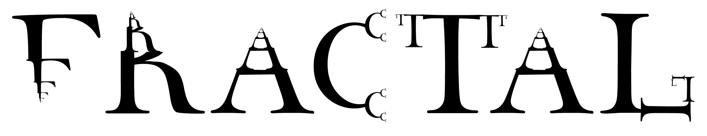
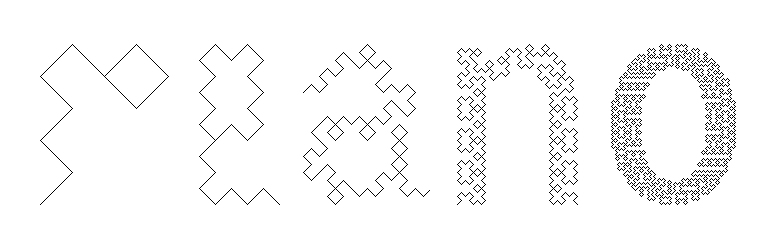
(January 2002) Originally this had an extra level (so it was 3 times as big) and was uniform across all letters. This works better however - it shows the process, and gets out of the problem of trying to depict a nowhere dense set using finitely many sets with nonempty interior (the pixels).
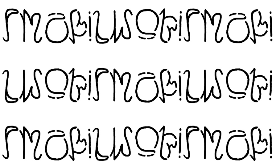
(January 2002) These are easier to read, some neat ideas. Some are more mathematically precise than others.
(January 2002) The first few. Strangely, the hardest 'puzzle' to work out was the first autologlyph I thought of.
Autologlyphs by others
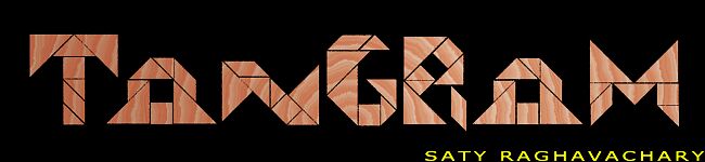
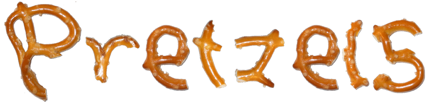
This was sent to me by Saty Raghavachary.

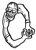


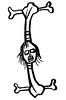
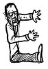
Zombie Letters by Len Peralta from e-zombie.com
Chris Wakefield's 9th grade physics class did a "Physics Font Project", a similar idea to autologlyphs. Here are the results.